You’re not supposed to judge a book by its cover, but I just can’t help myself. There are times when you look at a book and think to yourself, “I need that on my shelf.” These are book covers that tantalize, that intrigue, that promise adventure and emotion. They are the covers that get me excited about the stories within. And I think it’s worth celebrating those covers – and the artists that create them. These artists are work transformative magic on a limited canvas. They’re an integral part of any reader’s experience, and today, I want to celebrate the art that stuck with me this year.
We’ll go backwards, starting with:
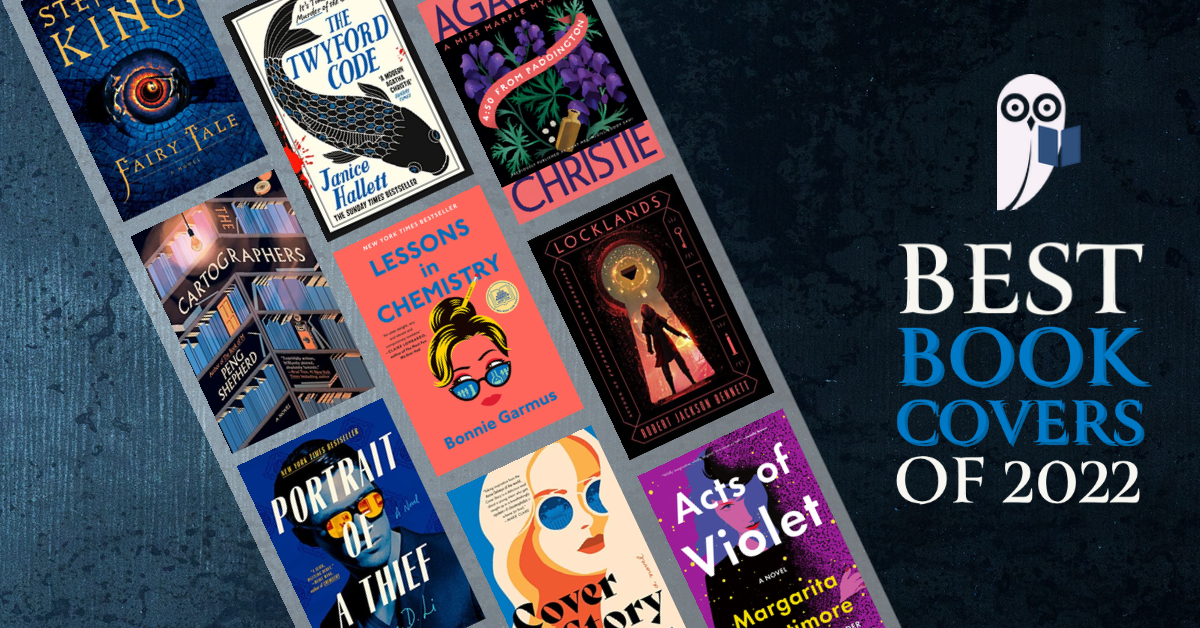
9. The Twyford Code | Steve Panton (@stevepanton)

To the extent that your appreciation of a cover is colored by your excitement for the book, I was predisposed to like this one. The Appeal by Janice Hallett was one of my favorite epistolary novels last year, and I couldn’t wait for this one to release. But Steve Panton made a cover that’s even more appealing than last time, perfectly representing the book’s vibe.
I love everything about this art – the dynamism of the fish, the splash of red on the left that bleeds over onto the spine, the primary colors on cream that suggest a somewhat historical adventure. There’s a sense of movement and action to the images. The slightly uneven baseline on the fonts lends to the handwritten, “found footage” / “found manuscript” feel. I couldn’t want to read The Twyford Code this year (and it totally lived up to my expectations).
8. Lessons in Chemistry | Jim Tierney (@jimctierney)

You will start to see a pattern in the covers that catch my eye: I like simple, bright statements, and Lessons in Chemistry is a great example of this style. The combo of coral, blue, and yellow is particularly striking. Elizabeth’s expression also intrigued me on first glance – why the side-eye? Why the eyebrow raise? The pencil suggests a creative woman at work; the reflected chemistry equipment highlights her scientific chops. As a formerly aspirational biochemist and a current PowerPoint power user, this duality was enough to get me to pick the book up to learn more.
Tierney’s art simply and effectively captures the feeling of reading this book. While Elizabeth herself is, at times, a bit larger than life, her expression on the book cover captures the feeling so many women have had with similar experiences. If only I could arch my eyebrow so perfectly…
7. Acts of Violet | Jaya Miceli (@jayam66)

Another mysterious face, this time peering out from a cloud of purple haze. If I’m perfectly honest, I saw this cover so much on Instagram this summer that I almost had to like it. But I’m a sucker for purple, and the arresting visual of a woman, disappearing, was bound to catch my attention. And so I picked up a copy of Acts of Violet, and to my delight found a fun epistolary mystery (does it count if they’re podcasts and emails? I say yes.), with a magical protagonist.
Jaya Miceli’s rendition of Violet’s inscrutable expression perfectly captures the character. You can see her determination, her unwillingness to go with the flow. She’s intriguing and challenging, daring you to find her. A perfect invite for a fun adventure of a book.
6. Locklands | Will Steahle (@unusualco)

I’ve loved every cover for The Founders Trilogy by Robert Jackson Bennet, and Will Steeple’s striking cover for Locklands is no exception. The keyhole visual is particularly arresting, and apt for the story (which involves a mysterious and magical key). The figure’s stance captures both a sense of awe and determination – fitting for the end to a long and exciting trilogy. And we’ve got our sparkly swoopies, a reminder of the otherworldly and magical nature of the book.
This cover is also special as it represent the final cover of the trilogy. Over the course of the series, it’s been nice to see the evolution in covers, particularly in the doors / holes that serve as our vantage point. Foundryside features a full door, showing the initial stability of the society; Shorefall features a rougher hole as Sancia and her crew continue to wreak havoc. The keyhole here shows how Sancia and Clef seem to be coming into their own. It’s a nice way to kick off an exciting, impactful end to one of my favorite recent fantasy series.
5. Portrait of a Thief | Vi-An Nguyen (@frenchchips)

I will cover later how and why I loved this book. (TL;DR – I love heists and I love cultural criticism.) This book cover perfectly captures the style and effortlessness of most major heist media, with a clear highlight of the Chinese protagonist. Given how often Asian protagonists are highlighted for other qualities – intelligence, CS skills – it’s really cool to see a cover that just shows a badass Chinese man.
I also adore the color choices on this cover. The royal blue and white combination are super-striking and the mustard glasses really pop. It’s an arresting cover that makes you want to take a look inside (and as I will explain more later this week – I think it’s worth the read!)
4. Fairy Tale | Will Steahle (@unusualco)

I literally stopped in my tracks when I saw this book cover. It’s so simple, yet so striking – and there’s so much going on beyond the first glance. At first, I thought I was looking at an eye. Upon closer inspection, I realized what was actually going on – a boy and his dog, traveling down a spiral staircase. As with Portrait of a Thief, I’m a sucker for this color choice – the rich blue and fiery orange give off the perfect fantastical vibe.
In the store, I doubled back again and again to take another look at this cover. Despite having a digital version, I was so enamored by this cover that I had to buy a physical copy to grace my shelves. I have absolutely no regrets – the publishers spared no expense and the paper quality is wonderful and the book jacket gorgeous. I’ve since purchased two physical copies as holiday presents (not just for the cover, but it sure helps).
3. Cover Story | Mumtaz Mustafa (@mumtazmustafadesigns)

We’ve already established that I like heists and cons (and epistolary novels, for that matter), and I had actually followed the Anna Delvey story before Netflix released Inventing Anna. So I was probably going to read Cover Story no matter what. But this slick, stylish cover moved the book up the TBR list for me – and actually pushed me over into getting a physical copy.
There is so much right with this cover. The simple, striking art, evocative of color-printed posters. The blue-and orange color scheme, evoking a sense of action in what is otherwise an image of a face. The multiple female silhouettes hidden in the flowing hair. The sunglasses and the perfectly arched eyebrow, daring you to figure out the mystery. It’s all a perfect encapsulation of the mystery and activity that surrounds Cat Wolff.
2. The Cartographers | Helen Crawford-White (@studiohelenbooks)

This cover is literally any bibliophile’s dream – once I saw it, there was no way I was not gonna read this book. The art is evocative – a single lamp, flickering over bookshelves that overflow with tomes and hide a couple of mysterious objects: a compass, a gas pump. You immediately start to imagine the academically-influenced adventure. The shelves are arranged in a corner, inviting you into the story. There’s basically no way not to read this.
You may have noticed a lot of blue covers on this list – I like the calm it evokes. While the more muted shades of blue and orange used here aren’t my favorite, I think they’re appropriate in evoking the historical timelines recalled in the story. Overall, this cover is perfect, as a representation of the story and as a work of art. I’ll keep this one on my shelf for years to come.
1. Miss Marple covers | Holly Ovenden (@hollydrawsinink)

These are the covers that started it all. We’re a few months into this blog project now, and I seem to actually be sticking with it – which means I can come clean about how these new covers for the Miss Marple series inspired me to start the blog in the first place.
I’m a bit of a book hoarder (big shocker, I know) and I try to limit my book purchases since space can get tight in the city. But when I saw these redesigned covers, I knew I wanted to have them, and I knew I needed a good reason to make the space on my shelf. And thus the Miss Marple adaptation series was born, and with it, The Cozy Owlet.
Why do I love these so much? It’s a long list – I love the floral illustrations, and how these covers evoke the time and place of the mysteries. I love the color choices and the font choices, how they feel like the best blend of classic and modern sensibilities. I especially love that Holly Ovenden managed to sneak in a profile of Miss Marple into each of the covers. In fact, I love these covers so much that I bought an entire set of a dozen-plus books in order to have a comprehensive collection. For me, that makes these hands-down the best book covers of 2022.
This is just the start of our Year in Review for 2022. Check back later this week for more lists of some of our favorite reads for the year – and what we’re most looking forward to in 2023.
Until then – stay cozy, and stay curious!